The most common question that we hear from our clients is what are wireframes and why are they important during initial phase of product design.
Wireframes help fine tune the product flow and design before the hard part of development starts.
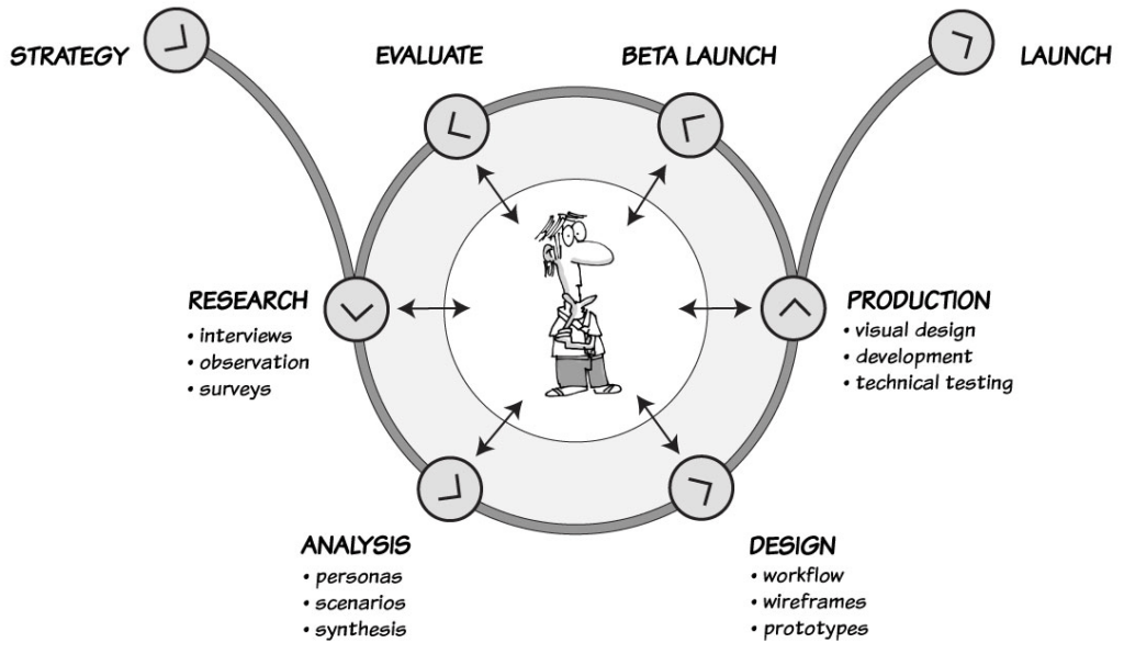
To design good wireframes, the user interface designer need to follow these steps:
1. Understand use cases
Use cases describe product features from the point of view of end user. Analyzing them is the first step that should be taken into consideration while developing wireframes.

2. Model user personas
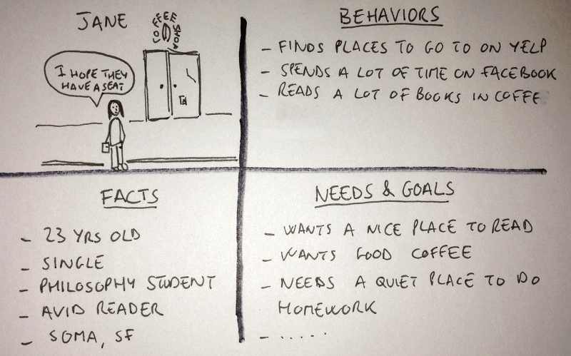
User modeling is essential because it defines the user of the product and goals they want to achieve by using the product. User modeling is done by creating personas with scenarios.
Personas are the fictional representation of the intended users with name, picture, relevant roles and behavioral characteristics. They allow designers to create wireframes and information architecture targeted towards specific demographics considering context of the product.

3. Group information together
Grouping information together allows designer to collect context-specific information and simplifies user interactions. Card sorting is a great way to group information together.

4. Define interactive flow
Flow design helps in defining intuitive navigation between different screens.
A designer should consider as many use cases as possible for the entire product during initial flow design. It is also important to understand current user behavior and familiarity with frequently used app interactions so as not to deviate from them too much.
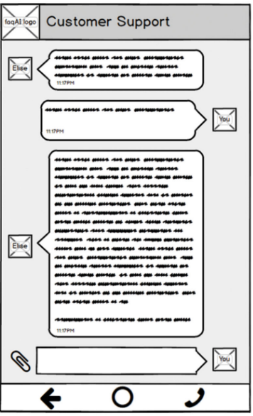
5. Design low Fidelity prototype
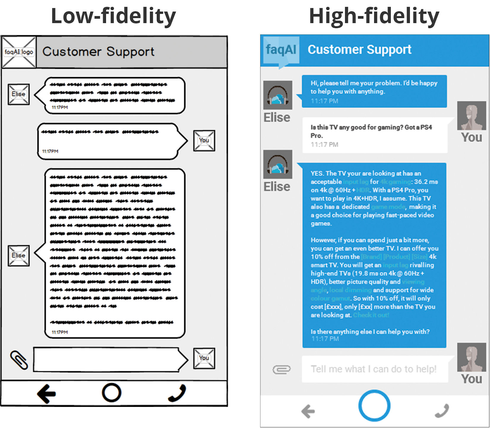
A low-fidelity prototype is a definitive representation of a concept, an information structure and a user flow designed for getting quick feedback on design. A low fidelity prototype support rapid experimentation and testing.

6. Design high fidelity mockups
The high-fidelity mockups includes information about original content, color, fonts, branding guidelines, specific information on image dimensions, button styles and specific typesets. Simple experiments with fonts, colors and spacing at this stage will improve visual appeal significantly and will also provide developers with exact assets for use during product development. The high-fidelity mockups allows product owners and consumers to visualize each static screen as close to the final look as possible.

7. Design micro interactions
Micro-interactions add subtle visual effects which can enhance user experience. The interactions should be used sparingly and at the right places to be impactful.

8. Develop interactive high-fidelity wireframes
Though this is laborious and expensive process, interactive high-fidelity wireframes are closest to the real application. They can be played on phones and give an impression of real-app though with canned data. So they can be shown to real users to get feedback on usability and concept validation before spending money and time on complete app or website development.
This article is a part of series of articles related to Design Thinking and User Experiences. If you are looking for a User Experience and Design team to build your solution, please contact us at hello@47billion.com.


