User experience of an OTP
Have you faced any such user experience irritant in your day to day life?
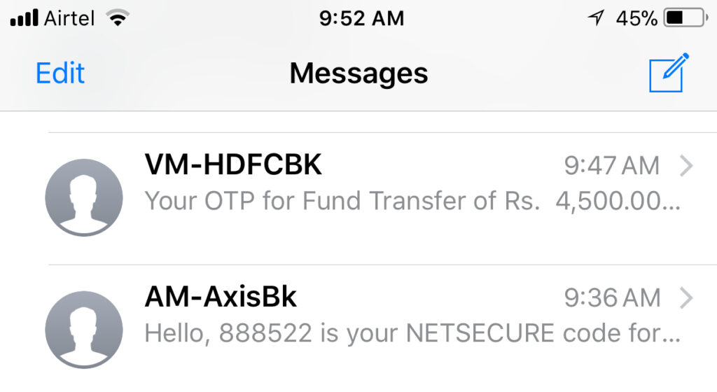
Today I made two bank payments through my browser with two different banks and realized how much user experience and design thinking is important. I have attached my phone’s SMS screenshot for SMS messages which carried the OTP.
First message shows the OTP in right as a second word in the sentence which means also shows directly on the alert message. It was as simple as looking at the alert message and filling the OTP in my browser.
The second message has OTP at the end of the sentence. So it required me to open the locked phone, then open the Message app, open the OTP message, look for the OTP within the message, memorise it and then enter it in my browser OTP field. And all the time I was worried that my transaction in the browser may time out anytime.
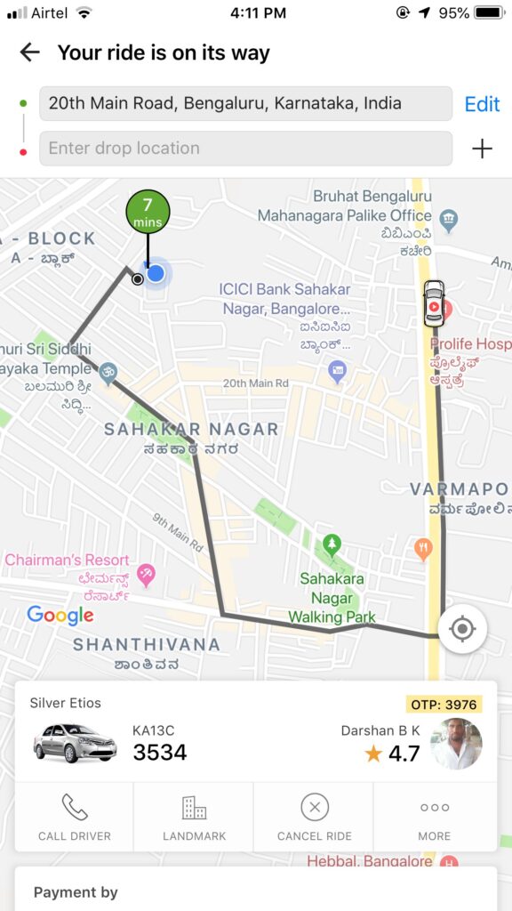
A similar bad OTP experience is related to Ola Taxi Booking App. It is mandatory for a passenger to verify the OTP with the cab driver before the ride starts. Ola used to send OTP in SMS as well as show it in the app. Due to some reason, the OTP is now shown only in the app. As you can see in the app snapshot, the OTP is shown in the smallest font somewhere at the bottom right of teh screen. Any user who is farsighted or have reading glasses, most of the time, is unable to read the OTP to give to driver. A simple user exprence would be just to increase the font size of the OTP so this mandatory operation is made smoother for the user.
This shows how a simple word placement or a font size can lead to a bad user experience. Any good user experience designer with an eye for details should avoid such mistakes.
This article is a part of series of articles related to Design Thinking and User Experiences. If you are looking for a User Experience and Design team to build your solution, please contact us at info@47billion.com.